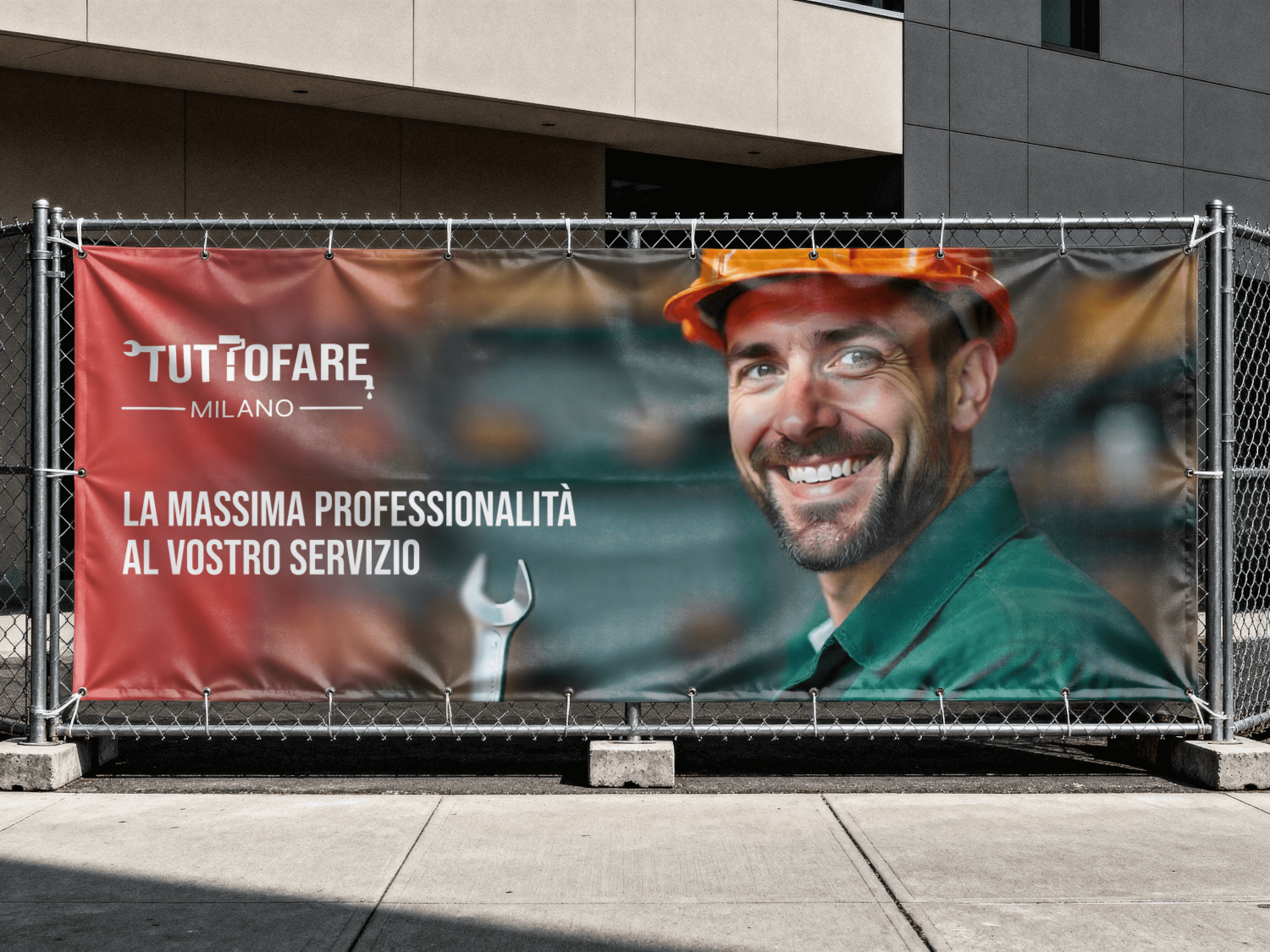
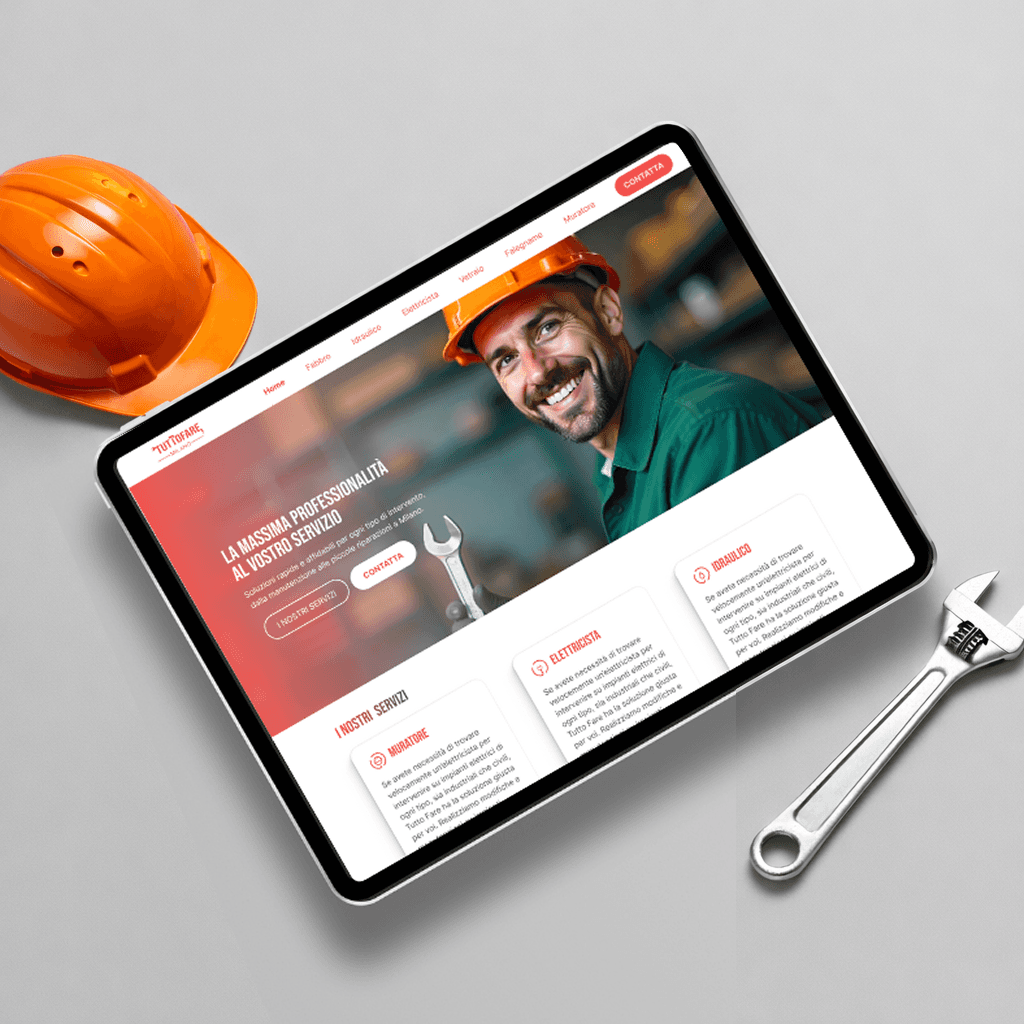
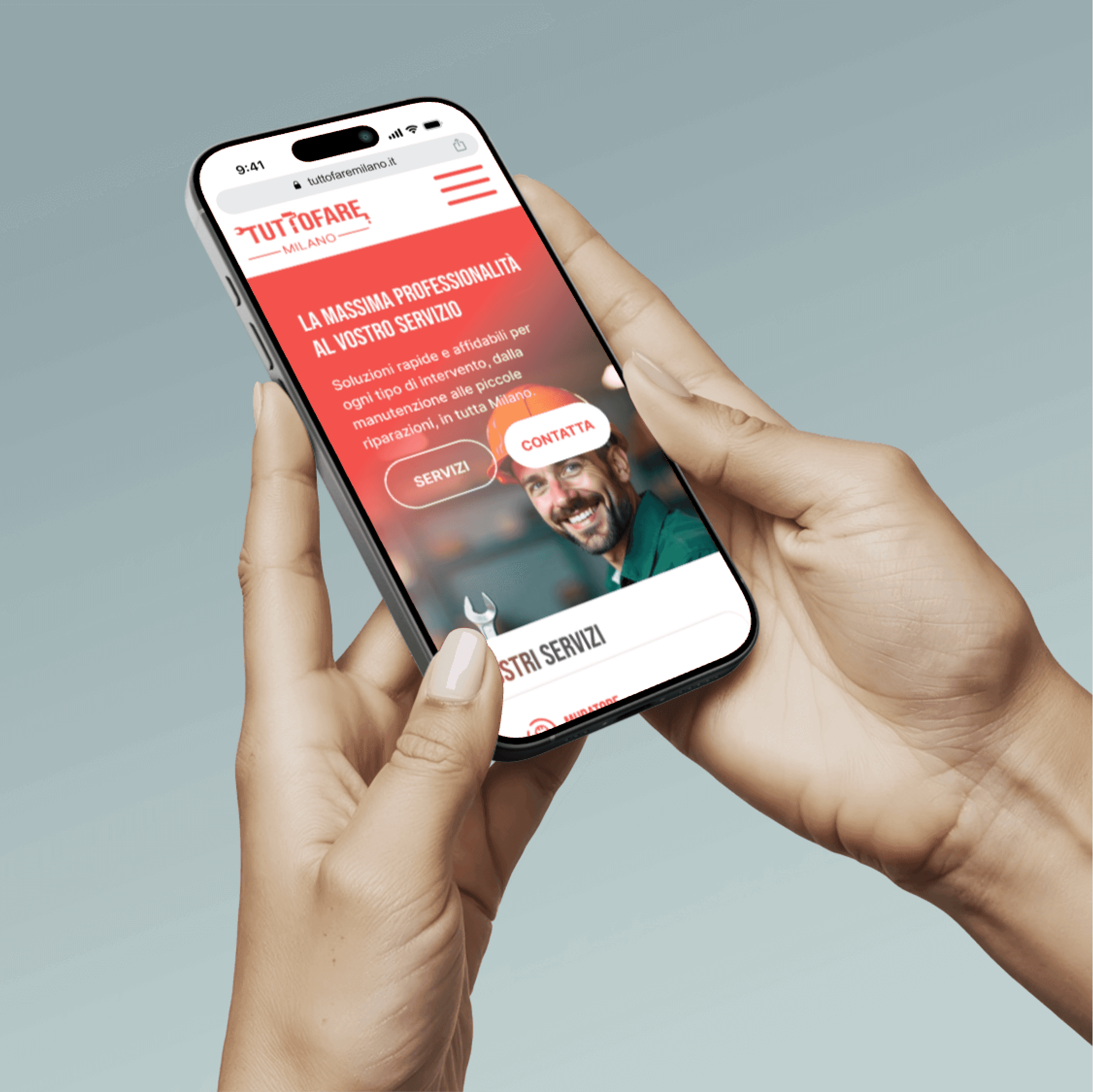
This project focused on refreshing both the UX/UI and the logo of a local service brand. The website interface was redesigned to improve usability and clearly communicate the range of services offered. The logo was refined for a cleaner, more contemporary look, reinforcing reliability and professionalism.
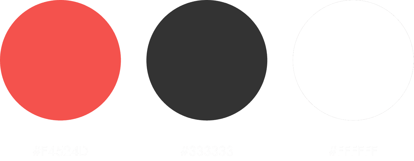
Red (brand continuity): energetic, reliable, consistent with the previous identity
Dark Gray: structure, readability, professionalism
White: balance, clarity
Together, these colors create a modern, trustworthy identity that supports the brand’s service-oriented personality.
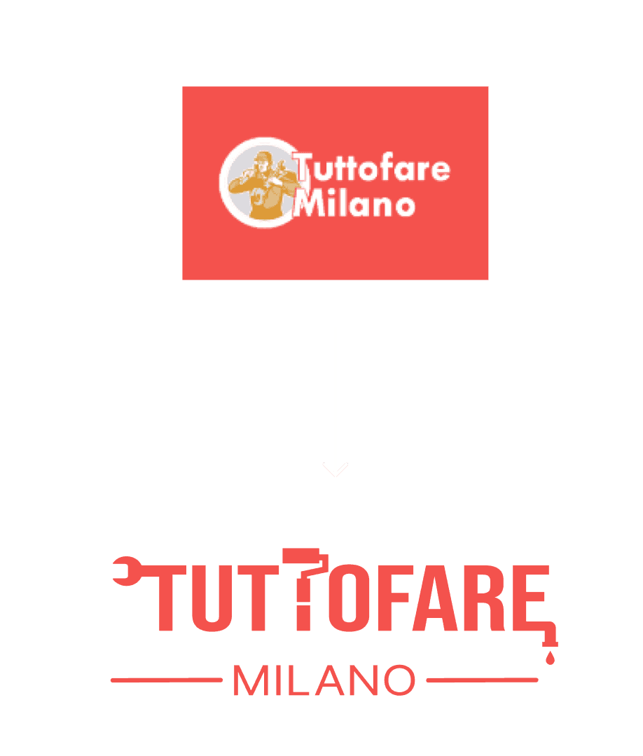
I created the logo for the brand on Figma. The logo refresh focuses on simplicity and usability. Illustrative elements were replaced with a bold, typographic mark enhanced by subtle tool references, improving legibility and adaptability while maintaining continuity with the previous red-based identity.


The brand needed a modern, trustworthy image while keeping continuity with its established identity. The website was cluttered, and the old logo felt outdated. Users needed to quickly understand the services and contact the company without confusion.
Feedback from customers showed that navigation was confusing, and service categories were not immediately clear.

Refreshed logo: simplified, modernized, retained red
UX/UI: redesigned layout, simplified flows, clear CTAs
Focus on readability, responsiveness, and accessibility
Highlighted key UI elements (buttons, forms, headers)
Redesigning an established brand taught me how to balance continuity and modernization. Small, thoughtful tweaks in color, shape, and hierarchy can dramatically improve usability and perception.